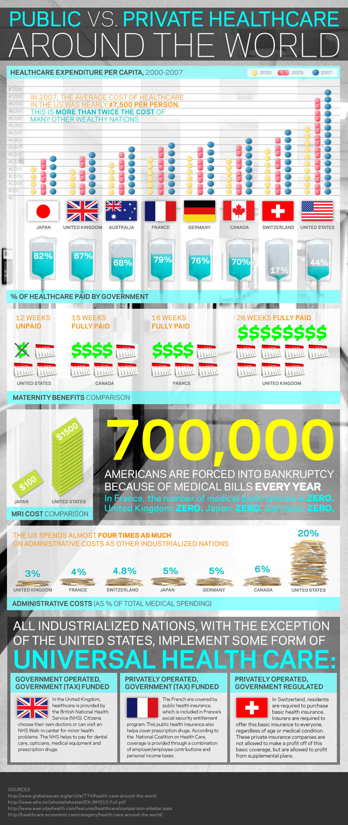
So I have to say that I am absolutely obsessed with the newly emerging infographics, and below is one of the best I have found to illustrate public healthcare vs. private healthcare.  As a member of a healthcare strategic management group, I understand how those in the healthcare field can become inundated with information, our hats off to killer infographics for illustrating public vs. private healthcare in a tidy but informative bundle!

Healthcare In a Nutshell

Private and public healthcare represent two distinct approaches to delivering and funding medical services, each with its own set of advantages and challenges. Private healthcare is often characterized by individual or corporate ownership of medical facilities, where services are offered for a fee. This model allows for faster access to care, personalized services, and a wider range of treatment options. However, it can result in higher costs, making it less accessible to those with limited financial means.

On the other hand, public healthcare is typically funded by the government and provides services to all citizens regardless of their financial status. This model aims to ensure healthcare equity, making essential services available to a broader population. While public healthcare promotes inclusivity, it may face challenges such as longer wait times and limited choices for certain treatments due to budget constraints.

Private vs. Public Healthcare Infographic


Private vs. Public Healthcare infographic